reCAPTCHA Accessibility Redesign
Leading design and development for a research project that achieved statistically significant accessibility improvements through rigorous A/B testing with 18 participants across vision ability spectrum
Overview
As Product Design Lead on a 7-person research team, I was the sole designer and developer responsible for creating a fully functional reCAPTCHA redesign that improved accessibility without compromising security. I designed the user experience, built the entire prototype from scratch, and conducted rigorous A/B testing with 18 participants across three vision ability groups (normal, low, and no vision).
The project combined my unique interdisciplinary background—leveraging psychology research methods, technical development skills, and accessibility design expertise to create a solution that achieved statistically significant improvements (p<0.001) in both completion time and error rates.
My Specific Contributions
Product Design: Led design workshops and decisions, designed the multi-challenge system architecture, and designed accessible interaction patterns for diverse user needs
Technical Development: Built fully functional prototype on Netlify, integrated Google Developers API Kit for original experience, coded redesigned experience from scratch using HTML/CSS/JavaScript
Security Validation: Wrote Python scripts using Selenium to conduct automated bot penetration testing, validating that accessibility improvements maintained security integrity
Research Collaboration: Collaborated with team on study design, statistical analysis, and presentation of findings
Impact & Results
"I could not pass the original CAPTCHA at all... The screen reader did not pick up on [the audio button]... I also could not understand the audio... In the redesigned CAPTCHA, I at least had a button to say the answer—and I could go back and use the haptic challenge."
Research & Discovery
Identifying the Problem
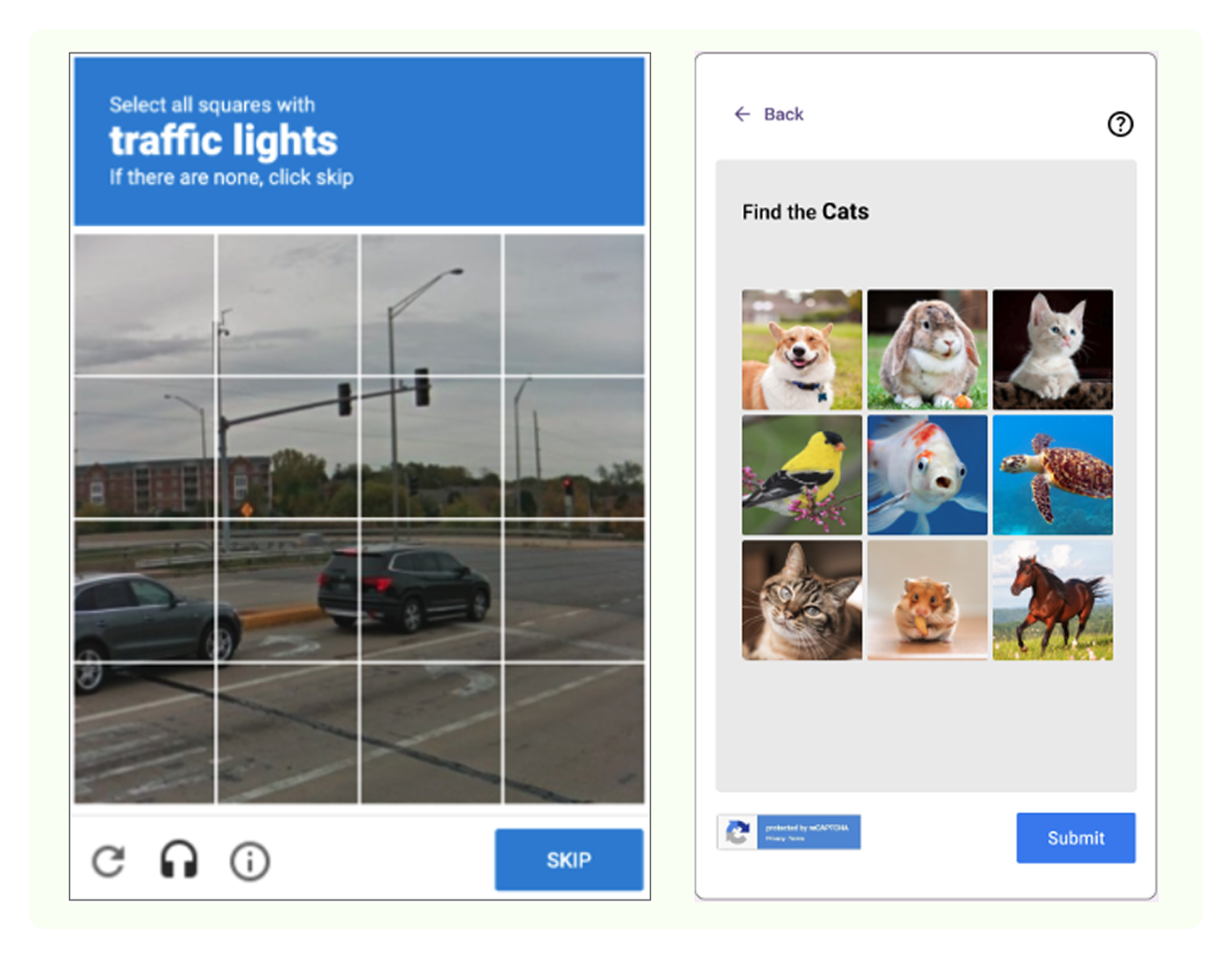
Current CAPTCHA systems create significant barriers for users with disabilities through over-reliance on visual tasks, lack of accessible alternatives, and absence of helpful feedback. Research revealed three critical gaps:
- Visual dependency: Image-based challenges exclude users with low or no vision
- Limited options: Few alternatives force users into unsuitable challenge types
- Poor feedback: No indication of what went wrong or how to proceed after failure
Research Questions
Our study investigated two primary questions:
Question 1: Usability
How can incorporating user feedback loops enhance overall user experience in reCAPTCHA without overcomplicating the design?
Question 2: Accessibility
How can reCAPTCHA V2 be redesigned to improve usability and accessibility for users with diverse needs (visual, motor, or cognitive impairments)?
Study Design
Mixed-methods approach: Combined quantitative A/B testing with qualitative thematic analysis
Participants: 18 users recruited across three vision groups:
- 6 users with normal vision (baseline control)
- 7 users with low vision
- 5 users with no vision simulations (screen reader users)
Testing protocol: Within-subjects design where all participants completed both original Google reCAPTCHA and redesigned version in randomized order. Moderator tracked completion time, error count, and qualitative feedback.
Statistical methods: Applied paired t-tests, two-way repeated measures ANOVA, and Fisher's exact tests to validate significance of improvements
Technical Implementation
Building a Functional Prototype
To conduct authentic A/B testing, I needed a real working prototype—not just mockups. I built the entire testing environment from scratch:
Prototype site: gestalt-gang-testsite.netlify.app
- Hosted on Netlify: Deployed functional web application for participant testing
- Original experience: Integrated Google's reCAPTCHA via official Developers API Kit
- Redesigned experience: Coded entirely from scratch using HTML, CSS, and JavaScript to implement new interaction patterns and accessibility features
Security Validation with Python & Selenium
A critical requirement was ensuring the redesign maintained security integrity. I wrote Python automation scripts using Selenium to conduct bot penetration testing:
- Automated bot attempts to bypass CAPTCHA challenges
- Tested each challenge type individually for vulnerabilities
- Validated that accessibility improvements didn't compromise security
- Documented security test results showing redesign maintained protection against automated attacks
This technical work demonstrated my ability to move beyond design into full implementation—building, testing, and validating solutions end-to-end.
Design Solutions
Core Design Principles
The redesign centered on three interconnected principles: Choice + Clarity + Feedback
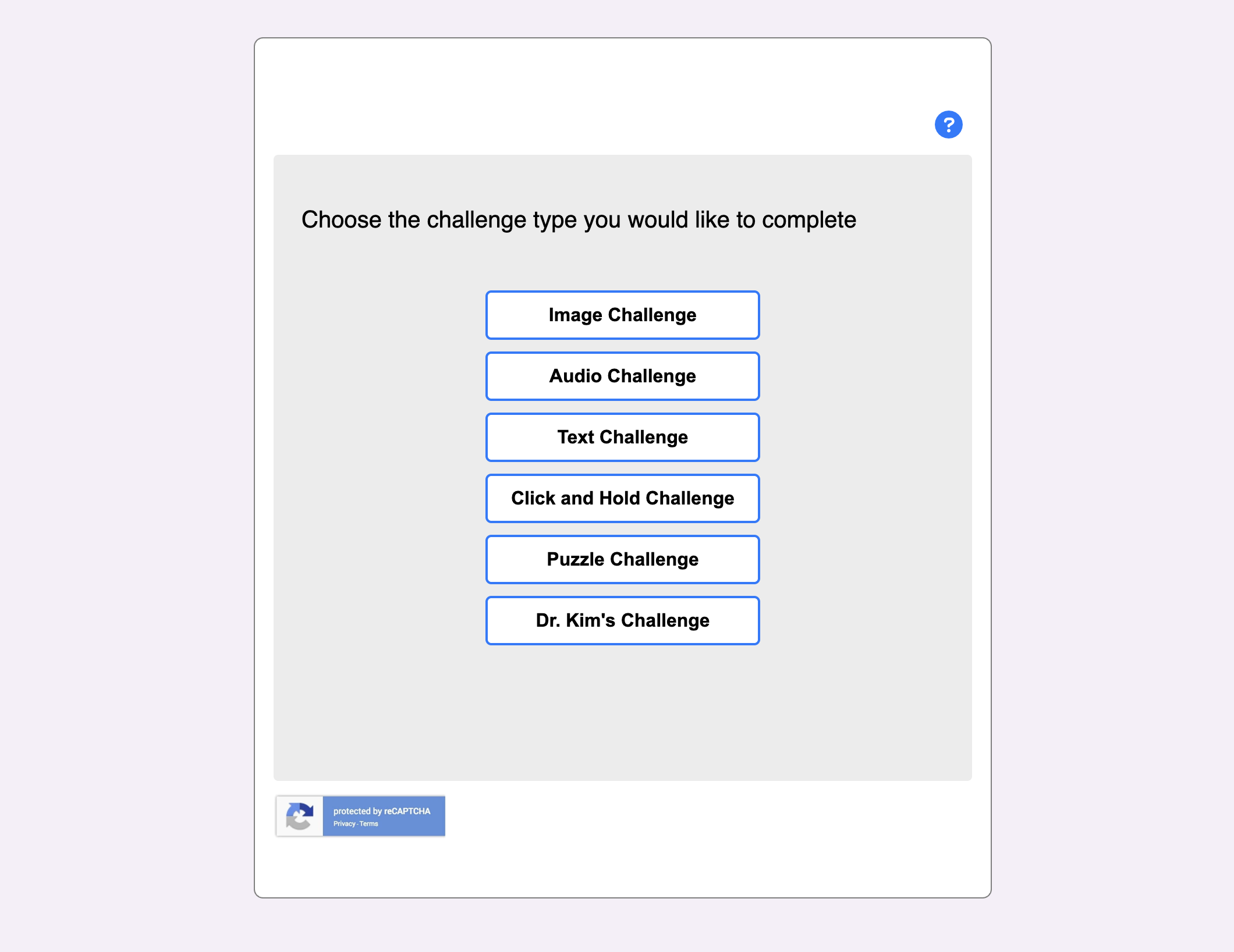
1. User Choice: Multiple Challenge Types
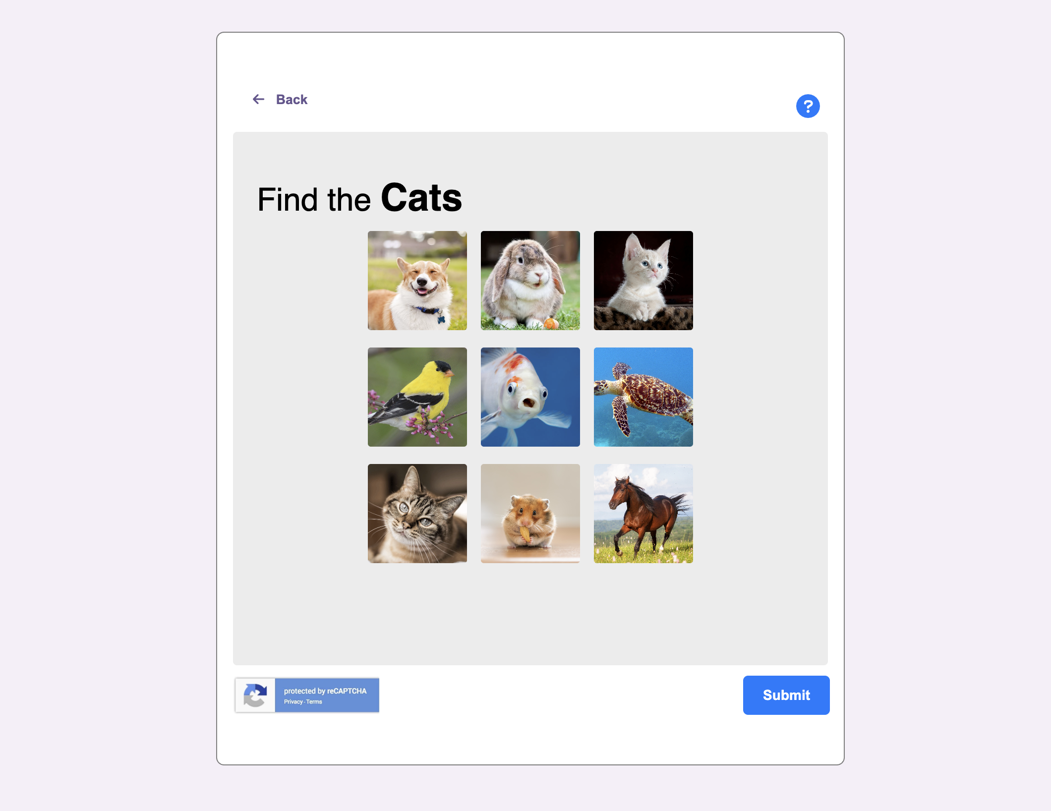
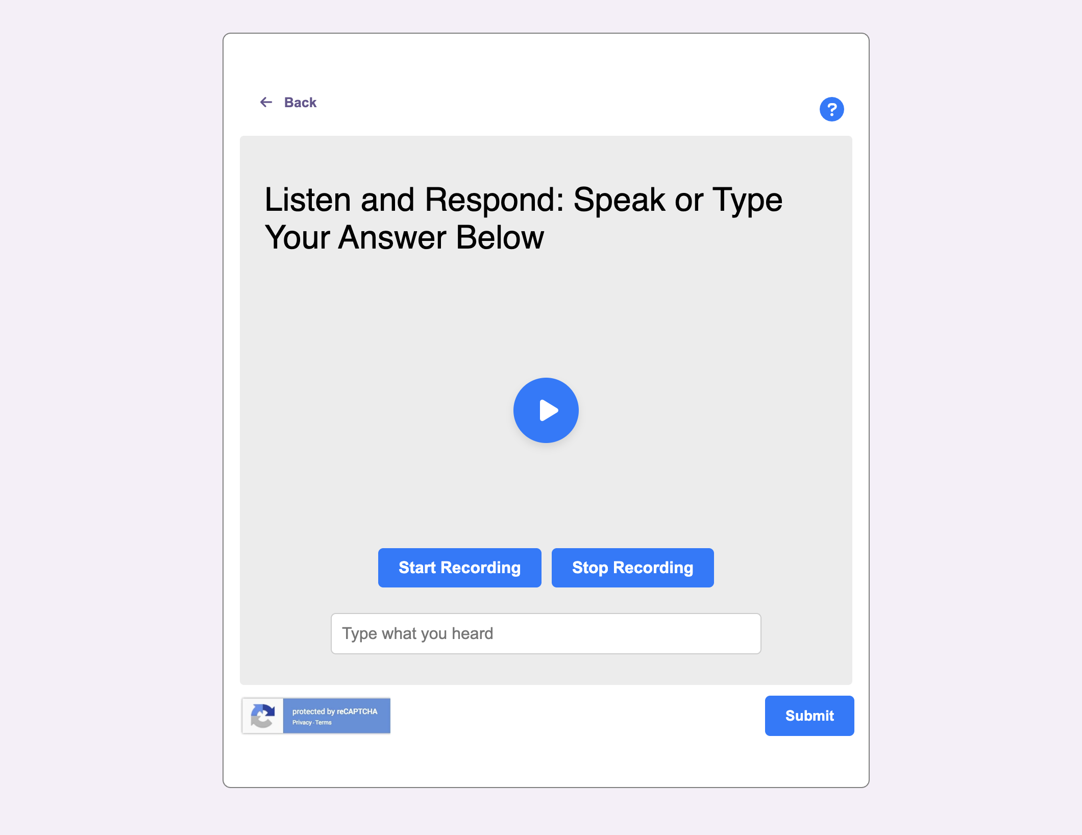
Instead of forcing users into a single verification method, I designed a system offering five distinct challenge options:
- Image Challenge: Visual object identification (removed confusing reference photos)
- Audio Challenge: Sound-based verification with recording capability for voice input
- Puzzle Challenge: Shape matching and orientation tasks
- Haptic Challenge: Pattern-based interaction (though user testing revealed "haptic" wasn't understood—redesigned in later iteration)
- Text Challenge: Reading and transcription tasks
Giving users control to select their preferred challenge type dramatically improved both satisfaction and success rates, particularly for users with disabilities who could choose methods matching their abilities.
2. Clarity: Simplified Visual Design
Removed visual clutter and confusion from original reCAPTCHA:
- Eliminated reference photos in image challenges that caused ambiguity
- Enhanced contrast ratios for low vision users
- Clear, concise instructions for each challenge type
- Semantic HTML structure for screen reader compatibility
"Had a hard time reading the text that said 'Chimneys' on the Google reCAPTCHA... With the puzzle challenge it was easier to see the shapes and solve it."
3. Feedback: Breaking the Frustration Loop
Original reCAPTCHA provides no indication when users fail—just endless new challenges. I designed an explicit feedback system:
- Success messaging: "Challenge Passed! Great job" with clear continue button
- Failure indication: "Try again" prompt explaining what to do next
- Progress visibility: Users understood their status at all times
- Exit paths: Ability to return and select different challenge type
"I don't like the continuous images in reCAPTCHA—and that it loads without feedback. The redesigned version clearly prompted me to 'try again.'"
Detailed Results
Statistical Validation
Applied rigorous statistical analysis to validate improvements weren't due to chance:
- Two-way repeated measures ANOVA: Testing version (p=0.001) and vision ability (p=0.001) both showed significant main effects
- Paired t-tests by vision group:
- Normal vision: p=0.010 (significant)
- No vision: p=0.012 (significant)
- Low vision: p=0.146 (trending toward significance)
- User preference: Z-statistic: 2.834, p=0.004 (highly significant preference for redesign)
Performance by Vision Group
Blind users (no vision) showed greatest improvement:
- 100% preferred redesigned version
- Could not complete original CAPTCHA at all in many cases
- Screen readers properly detected new interface elements
- Audio and haptic alternatives provided genuine accessibility
Low vision users:
- 57.1% preferred redesign
- Emphasized frustration with original and value of customization
- Puzzle challenges with clear shapes easier than ambiguous images
Normal vision users:
- 83.3% preferred redesign
- Focused on clarity, flexibility, and feedback improvements
- Faster completion even for users without disabilities
Qualitative Themes
Thematic analysis of user feedback identified six primary themes:
- Accessibility/Assistive Technology: Screen reader compatibility, alternative input methods
- Clarity & Ease of Use: Simplified instructions, reduced ambiguity
- Customization/Flexibility: User choice, multiple challenge options
- Frustration: Endless loops, unclear requirements (original only)
- Feedback Loop: Clear success/failure messaging
- Familiarity/Simplicity: Intuitive interaction patterns
Fisher's exact test showed blind participants emphasized accessibility and clarity significantly more than other users (p=0.0423, odds ratio=10.22), validating that design changes meaningfully addressed their specific needs.
Design Insights & Iterations
Observations from Testing
User testing revealed several unexpected findings that informed design refinements:
- "Haptic Challenge" confusion: No participants understood what "haptic" meant. This led to relabeling with more intuitive language in subsequent iterations.
- Text challenge avoidance: Zero participants selected the text challenge option, suggesting it wasn't perceived as valuable or was poorly explained.
- Help button ignored: Despite designing a prominent help icon, no participants clicked it. This suggested either the interface was sufficiently clear, or the help pattern wasn't discoverable.
- Familiarity bias: Image challenge, positioned first in the list, was selected most frequently—suggesting order matters for user choice.
Prototype Improvements Based on Feedback
Following initial testing, I implemented several refinements:
- Simplified instructions: Rewrote challenge descriptions after users reported confusion, particularly for puzzle orientation
- Repositioned recording button: Moved "Start Recording" button before text input in audio challenge to improve discoverability
- Clearer challenge labeling: Replaced technical terms with plain language descriptions
- Added gamification elements: Incorporated more engaging visual feedback in puzzle challenge based on mentor (Dr. Kim) recommendations
Expert Interview Insights
An interview with a security expert revealed how modern CAPTCHA systems work:
"Today's CAPTCHA analyze human behaviors: How you move the mouse, the way you click the mouse, how long you take to answer. In the past, the goal was identify objects like dogs to prove you are human. But now, AI can solve image tasks!"
This insight informed our security testing approach—validating that behavioral patterns (mouse movement curves, click duration of 0.1-0.2s per GOMS-KLM model, response timing) were properly captured alongside challenge completion.
Key Takeaways
Accessibility Requires Both Design and Technical Execution
Understanding WCAG guidelines isn't enough—you have to know how to build properly semantic HTML, implement ARIA labels correctly, and test with actual assistive technologies. Being able to design AND code accessible solutions means I can ensure implementation matches intent rather than relying on developers to interpret accessibility requirements.
Statistical Rigor Transforms "Good Design" into Defensible Strategy
Quantitative validation (p<0.001) moves accessibility from subjective preference to objective improvement. This research methodology—applying academic rigor to design decisions—produces solutions that withstand scrutiny from stakeholders, legal teams, and business leaders who need data-driven justification for accessibility investments.
User Choice is More Powerful Than Perfect Solutions
Rather than trying to design one "perfect" CAPTCHA for all users, offering multiple challenge types with user control produced better outcomes. Accessibility isn't about one-size-fits-all—it's about providing options that respect diverse abilities and preferences. This principle applies far beyond CAPTCHA to any system serving varied user needs.
Managing Teams Means Trusting Imperfect Contributions
My instinct to handle all design and development work myself was inefficient and unsustainable. Learning to delegate tasks matching each team member's capabilities—even when their work didn't meet my personal standards—taught me that effective leadership means empowering others rather than controlling everything. Collaboration skills matter as much as technical ability.